Tuesday, June 12, 2007

“Alarm Bells” in User Research

I have gone to many big SAP customers in India for User Research and there are a few things i have learnt to be wary of when going to big Organizations for User Research:

  • Set the expectations right beforehand itself. You haven’t gone to talk about new features in the upcoming releases, you aren’t from Marketing, you aren’t there to provide Technical support. Too much time gets wasted till they actually understand the purpose of your visit.
  • Guard against spending too much time in the Boardrooms. As I have come to realize, nothing worthwhile is ever achieved in Boardrooms. :) Go to where the user actually sits. His workplace can speak volumes.

  • Be on your alert when the user starts using phrases like ‘usually…’, ‘in our company..’, ‘in general…’, ‘normally…’. Ask him specifically as to how HE does the task or better still, ask him to show it to you. There might be differences in the way he says he works and how he actually works.

  • Be careful as to who is watching the user perform the task…his Manager, IT Staff… it changes the way he will interact with the system

Similarly, do not interview the User in front of his superior. It will tone down his responses regarding the difficulties he faces with your software or the workaround he uses to get his job done.

  • Write down beforehand high-level ‘Bullet Points’ regarding questions you would really like answered. Otherwise, if you only ask him to run you through a task on a system, you might only end up doing Usability Bug-fixing.

User Research: Being smart, being practical

In Design School we were taught how to go about User Research in a thorough and meticulous fashion. In real life in the industry, there is seldom time for that. One usually comes up with good-enough short cuts which work.


I have done extensive User Research with SAP customers in India and have realized some marked differences in the way we used to do it in back in the Design School. The reason of this difference seems to be two-fold:

  1. Shortage of time to do something elaborate
  2. The difference in the domain and the user group itself (Enterprise product versus Consumer products I was used to working on before)

Some smart moves during User Research (in the Enterprise domain) are:

1. Identify appropriate customers and interviewees

Creating ‘Test Participant Profile’ not ‘Personas’

A TPP is a shorter, more focused version of a Persona, covering only:

  • Role Names and Functions
  • Business Tasks
  • Skills
  • Software Expertise

Simply because creating a whole persona is very time-consuming and factors like a user’s name, social profile etc. has little or no bearing on his work profile in a Business Software usage context. Further, it can be safely assumed that the users belong to a narrow group with a certain educational background, proficiency and skill level.

This is in contrast to gathering User data for Consumer software (like mail, ticket booking software etc) where a broader range of information consisting of a user’s social profile, interests etc. is required, simply because the user group is so large and varied and a user’s overall profile does affect his usage of such software

2. Having diversity in your ‘Interviewee group’

Suppose we interview users in 2 companies:


Company A: 10 to 50 employees
User roles not so defined; 1 user managing multiple roles
Not very refined processes, crude workarounds to problems


Company B: 500 to 2000 employees
Very streamlined user roles; 1 user managing only 1 role
Very refined processes, sophisticated workarounds (in house developed tools)

Therefore, not surprisingly, the data collected from the 2 sets of users is very varied and the user requirements widely different.


In such a case, during synthesis of this research, the data from these 2 companies should not be combined, as it will distort the data, which will not hold true for any scenario.


In this case, providing Customization at the user’s end is the optimum solution

Friday, May 11, 2007

Nitty gritties of Dashboard Design..

A Key Performance Indicator (KPI) on a Dashboard is typically a metric which monitors a certain aspect of you System Landscape. In its basic state, a KPI shows 3 kinds of information:

The metric it is monitoring

  1. The value of the metric at that given time
  2. The status of the metric (in comparison to the thresholds set)


Apart from this, there are other kinds of information required to make a KPI more effective:

  • The Threshold values
  • The age of the KPI value (i.e, how old is the data)


Primarily there are two kinds of KPIs on a Dashboard:

  1. KPIs which show Availability information
  2. KPIs which show Performance information


Availability KPIs

Availability KPIs typically show whether a system/service/software component is up, down or in warning state.

Since they don’t have any value attached to them, they are the simplest KPIs to represent.

They are most commonly represented with Red and Green Traffic lights; although my opinion is to just show Red lights when appropriate; since that is what the Admin is interested in anyways…and also it avoids unnecessary clutter on the UI

Performance KPIs

A Performance KPI can show either a percentage value, or an exact value. Sometimes (but not always) it is a good idea to represent the percentage values using Progress Indicators. The idea is to draw attention only to the most crucial KPIs, so use special controls like progress indicators or pie charts only for certain key KPIs and not all of them to avoid visual noise and distraction.

But the problem with progress indicators existing today is that they are difficult to read and do not capture Threshold information at all. I have redesigned the Progress Indicators and adapted the Pie chart so that it can be used conveniently in a Dashboard context.

Friday, May 04, 2007

Dashboard Design: Too much in too little?

I have been working in the Administration and Monitoring domain for a while, and have been dealing with the problem of representing the enormous data which needs to be displayed on a Dashboard in an effective manner.

The purpose of a Dashboard is three fold:

1. Give a complete overview of overall health of your landscape

2. Highlight the critical information such as exceptions and error

3. Provide the possibility of a further drilldown to investigate and identify the root cause of the errors

Based on my experience, I have come up with certain Rule of Thumbs while designing a Dashboard. From a UI perspective, the problem needs to be tackled at multiple levels:

1.What information needs to be shown?

2. How it needs to be shown?

3. What would be the interactions?

Lets see each of the problems one by one:

1. What needs to be shown?

The most efficient way to determine this really is to do a lot of User Research to find out what information in general and KPIs (Key Performance Indicators) in particular do the Administrators want to see. From my experience, this usually varies to a great extent with only about 60-65% of commonality in the responses as to what the users would like to see on a Dashboard.. The easiest way out of this problem is to give a default set of KPIs but simultaneously provide the flexibility of Customization at the users’ end.

Next, out of this entire information that needs to be shown, segregate the information on the basis of criticality so that you know what needs to be highlighted.

In cases where the amount of information that needs to be shown on a Dashboard exceeds the available screen real estate, employ the technique of Progressive Disclosure. Show only what needs attention, what went wrong or what is most crucial upfront. Everything which is fine can be hidden until it goes wrong :)


2. How it needs to be shown?

This can be further broken down into 2 layers:

  1. How does each KPI needs to be displayed
  2. How does the overall information needs to be layout on the limited screen real estate

i). KPIs themselves can be classified into:

a) Availability KPIs

b) Performance KPIs

These need to be represented differently. I have explored a few possibilities for effective KPI representation, which I will discuss in another post.

ii).Further, there needs to be separate areas for different kinds of information. Utilizing the rule of eye movement across the screen, the most crucial information (i.e. errors and alerts) needs to be shown at the top of the screen

Also, different kinds of information can be grouped and represented in different iViews.

  1. What kind of interactions?

The whole idea of a Dashboard is to give a complete overview of the landscape in one go, without the user having to do any clicks. So at the first level, there should be the need of as minimum interaction as possible.

At the same time, there should exist possibility to drill down to a second level to the relevant reports, monitors or systems for further investigation in case of errors or problems in the ladscape.

Sunday, February 04, 2007

“Intuitiveness” in the context of Enterprise Software

As a designer, the ultimate aim of my job is to make the Product I am involved with easy or intuitive to use. How do you judge the ease of use or intuitiveness of your software? For common consumer product like Mail or Ticket Booking software, we are often given the age old wisdom of “If my mother can use it conveniently, it is intuitive”

But how do you define “Easy” or “Intuitive” in Enterprise Software or Administration and Monitoring Tools? It is senseless to assume that a user can use complex software without any training or help whatsoever.

The ‘Ease’ or ‘Intuitiveness’ needs to be measurable. Anything which cannot be measured, cannot be compared. And so, a difference between the ‘Intuitiveness’ of 2 softwares, cannot be defined. (This is precisely what is the aim of Benchmark Usability Testing)

Also, the perception of ‘Simplicity’ itself varies from context to context.

The average user of Enterprise Software expects a certain learning curve or training for the software, and this expectation is factored in while defining simplicity for such a software.

Whereas, even a very small Learning Curve might prove fatal for a Consumer software like Mail, typically because a user’s motivation for learning such a software is much lesser than software necessary to do their jobs in their workplace.

Below are a few parameters which can be measured to judge the ‘intuitiveness’ in the context of any complex software:

  • Measure the steepness of the Learning curve in terms of the no. of man hours of training required
  • No. of trained FTEs required to do the job, for a particular volume of work (no. of Systems monitored, no. of Alerts resolved, no. of Purchase Orders processed?)
  • Measuring Task Completion rates, Task completion times
  • How conveniently it allows the user to do the task vs how a user would have accomplished the task in the absence of the software; How much does it reduce the dependency of the user on ‘Workarounds’: (No. of manhours saved?)

Tuesday, November 15, 2005

Visualisations for a Tagging based system

Visualisation of Search Results of a Tag based Search


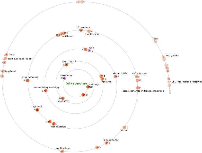
This is the visualisation of the Search Results generated for the tag 'Folksonomy'. Here each dot represents one result ; and the results are sorted by the no. of tags on the result. The violet tags are the ones already existing in the user's bookmarks list. Only the 'unique tags' (if any) for every result are shown.

Also, only the first say, 40 results are shown , as most users would be interested in these only. The remaining results can be viewed by clicking at the arrows at the end of the Spiral. Further, the name of the url represented by tht dot , along with all its tags can be seen on rolling over that dot.

I feel the beauty of this visualisation is tht it gives a Systems level view of all the Search results, in relation to where they stand in comparision to the other results.

Visualisations for a Tag Match

During my Research on tagging based systems I came up with an idea
of making use of Tags as the profile indicator of a user. This tag
matching can be used to find people with similar interests as yours and
you can then subscribe to their bookmarks list (for ex. In delicious) or
just for social networking.


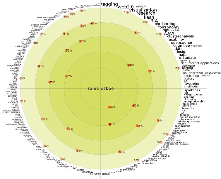
The idea is that you match your tags with all the users of the system , and the results are displayed as the percentage of tags
matched with that user (here each dot represents a user).
The innermost ring is for users with >90% tag match ; the next ring is for
users between 80 to 90% match and so on. Also the system should be intelligent enough to analyze the distribution of the tags matched. The
angle at which these dots lie indicates that out of the tags matched, the dominant tags in the other user’s library are those lying on the outermost
periphery. What this means is that the users lying in the first quadrant (and the innermost ring) are the most relevant ones for you, since their
dominant tags are also ur dominant tags , and as you move clockwise ( even within the same ring) the matching with users decreases, as their dominant
tags are ur not so dominant ones.

Thursday, October 13, 2005

Analysis of Yahoo! Podcasts

Technological Issues:

The biggest problem with hearing to podcasts is that due to limited bandwidths (which is the case with majority of the users). The podcast is not heard as a smooth, uninterrupted recording, but heard in chunks of 3-4 seconds. Hearing to such short bursts, and that too in a foreign accent, makes most podcasts utterly incomprehensible, and an irritating User Experience.

Instead, if these podcasts are buffered somewhere on the Client side, and delivered in chunks of say, 1 min, or 5 mins (decided by the user), it would be a much more satisfying experience. And while the user is listening to the first chunk, the next chunk simultaneously gets loaded. The user would be willing to wait for a brief period of time, if he gets a seamless experience later. In its present state, only the few podcasts in the popular category ( which are stored in the cache on Yahoo servers) offer a certain degree of seamlessness.


Even if a user does not listen to the Podcast directly from the website, and decides to download it, he or she would like to listen to a few minutes of recording atleast, to decide whether he would like to download it or not.


Usability Issues:

Rating:

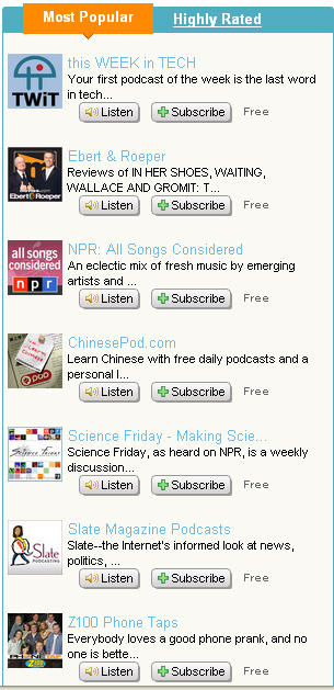
Most Popular :
This category does not make it evident to the user, about what is the basis of this popularity, and on what basis are the results sorted. Is the popularity on the basis of no. of subscribers, no. of downloads or what?
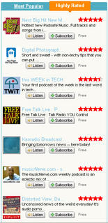
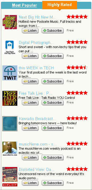
Highly Rated:

Same is the problem with this category. Firstly, the results are not sorted on the basis of ratings, and secondly, almost all the podcasts in this category have a five star rating. So, a user does not know on what basis are these podcasts sorted. Probably, the no. of users which have rated the podcast ( and thus contributed to the overall average rating) would be a good measure of the reliability of the rating, and a good yardstick to sort the results.

Podcasts within a particular category:

Again, within a category, its not clear on what basis are the Podcasts sorted. They don’t seem to be on the basis of ratings, or no. of subscribers or any other popularity parameter.


Rating of Series:

Its not evident how does the rating system of the podcasts work. Whether or not the rating for a series is affected by the rating of its individual episodes. If yes, than how?


Content:

Information about the content of the podcast:
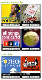
All the podcasts have a few words from the Introductory line, to tell the user what the podcast is about. In most cases, these few words are totally meaningless and superficial and don’t convey the information about the content at all. Instead,tags allocated by the listeners to the podcast give much more relevant info about it in just as many words. So, probably, the top 5 tags for that podcast would be much more effective in conveying its content.

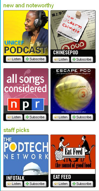
Same is the case with the Podcasts in the ‘new and noteworthy’ and ‘staff picks’ categories. The big promotional images for the podcasts tell nothing about their content and only add to visual clutter.

Tagging of Podcasts:

Along with putting all the Tags for a series together as one cluster, it would also be helpful to give the tags associated with each episode along with the episode, to know which specific episode has that content specified by the tag.


Thus the system should allow putting not only series specific, but episode specific tags as well, which would be a more efficient way of tagging as far as searchability of content is concerned.


Accessing of specific content within the Podcast:

As the no. of episodes within a series increases (already a few series have more than 100 episodes), it would be convenient to allow searching for a particular tag (from within the cluster of tags assigned to the entire series), within a series itself and kind of filter out only those episodes from a series which have that tag.


Further, many podcasts are over 1-2 hours long. How to search for specific content within the episode is an issue which needs to be addressed. Probably the episodes need to be Time-tagged i.e. tagged along the timeline, with the episodes divided into smaller chunks according to the content. Further, the first few seconds of each such chunk can also be combined together to kind of form the Headlines or Highlights of the podcast, just like in any news show on TV. The user can then just listen to these Headlines to get a brief summary of the Podcast, and then choose to hear or download the full Podacst, or specific chunks of it.

Scalability of the System:

As more and more users start tagging the Podcasts, there would be tremendous pollution in the Tag Library, simply because tagging in its present form is a free text entry kind of system, where any user can give any tag. So synonyms, acronyms, misspelt tags etc. will become major hinderances to searchability of information and reduce the effectiveness of the system unless accounted for. This problem will worsen for systems like Yahoo Podcast which allow multi word tags than systems like del.icio.us ( a social bookmarking tool), which only allow single word tags.


For ex., tags like ‘Tech’ and ‘Technology’ are very similar, as tech is an acronym of technology. But when a user searches for all podcasts about ‘technology’ (in reality, all podcasts about ‘tech’ and ‘technology’), he only gets podcasts tagged with ‘technology’ and not ‘tech’.


Thus, the challenge is how to make the system realize that synonyms like ‘movie’ and ‘film’ , acronyms like ‘technology’ and ‘tech’ and singular and plurals like ‘computer’ and ‘computers’ are similar and therefore the podcasts tagged by such tags are also displayed in the search results.


Monday, October 10, 2005

my tryst with Info Viz....


over the past few months, I hv become keenly interested in Information visualization….had a course on it recently, and became hooked to it…


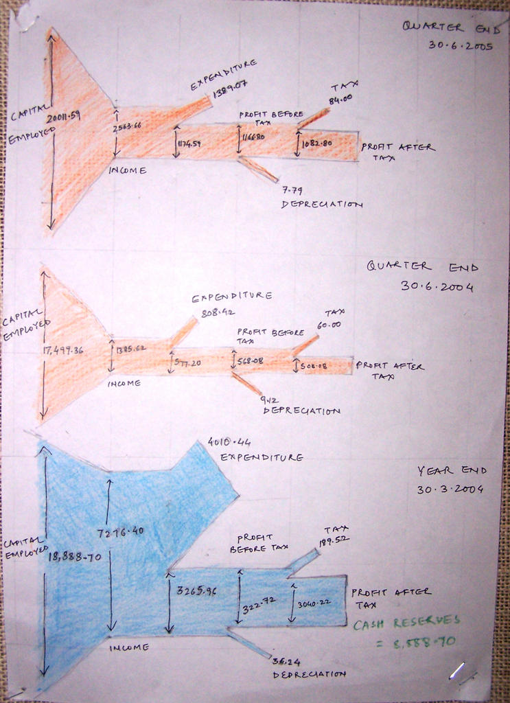
the first crash assignment was on visualizing the quarterly financial reports of IDFC…found it to be fascinating….but a huge struggle at the same time….majorly because my knowledge about finance was a big ZERO….to understand the jargon of the financial world, understand tht data, sieve through it ,extract the relevant info and make it comprehensible to the average person……….all of this in half a day was a task indeed!!.....Imagine visualizing….”Paid Up Equity Share Capital”…and u’ll know wht v were up against!!...


anyways, v came up with a Charles Minardish representation for the entire flow of the capital within IDFC…..right frm the Capital employed to Profit After Tax..


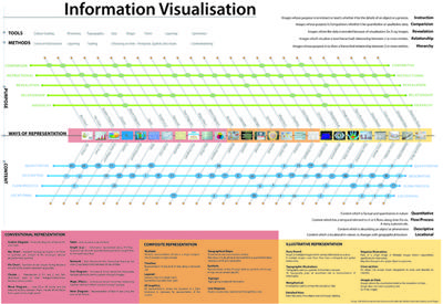
Our major assignment was sorting and categorizing through 1800 examples of Info Viz from books, magazines and the web…and come up with a classification scheme of our own…After a lot of brainstorming, we came up with a scheme of analyzing any Infographic along 5 axes:


Tools used

Methods used

Purpose of Representation

Type of Content

Way of Representation

The basic idea was to come up with a Designer’s guide to Infographics…and we tried to look at any Infographic lying along an n-dimensional space , having co-ordinates along each of these axes


Tools used

Color coding, Proximity, Typography, Size, Shape, Form, Layering, Symmetry


Methods Used

Level of Abstraction, Layering, Scaling, Choosing an axis- Temporal or Spatial

The tools and methods are generic, and go into the making of any Infographic, independent of the Content, Purpose or Way of Representation.


Purpose of Representation

Instruction- Images whose purpose is to instruct or teach; whether it be the details of an object or a process.

Comparision- Images whose purpose is Comparision; whether it be quantitative or qualitative data.

Revealation- Images where the data is revealed because of visualization. Ex. X-ray images.

Relationship- Images which visualize a (non hierarchial) relationship between 2 or more entities.

Type of Content

Quantitative- Content which is factual and quantitative in nature

Descriptive- Content which is describing an object or phenomena

Flow/Process- Content which has a temporal element to it i.e it flows along time. For ex. A story, a process etc.

Locational- Content which is locational in nature i.e changes with geographical location

All these assignments were done as a group work.

Saturday, October 08, 2005

Folksonomies....my 2 penny worth of bit about it....

Timing in life is important….never have I realised it so much, than in the past few months.When I had started my Systems Design Project on Tagging in July, no one (atleast in the IT savvy community of Gandhinagar) had even heard of it and now, barely 3 months later, it already seems like an overused word. Tagging this and tagging that, blogging this and podcasting that. Anyways, I have realized what an enormous advantage being the first player in the field can be…

To cut a long story short, I worked on Information systems for the web for my Systems Design project-specifically, Information system for Web 2.0 wherein I studied Tagging based Systems aka “Folksonomy” . I analysed the social bookmarking system of del.icio.us and needless to say, since folksonomies are just in their nascent stages and have to evolve much more before they can become robust, stable systems, there were loads of issues which needed to be solved. I looked into many such issues and how they can be addressed.

Existing System:

Input

  • Free text entry for tags
  • Tags are space delimited(therefore multiple word tags are not allowed)
  • Every user has his own way of creating compound tags(+ or / or _)
  • No synonym/acronym control
  • No singular/plural control
  • No guard against wrong spelling
  • Different kinds of tags all entered together
  • Types of Tags:

  • Attribute of the media (Ex.article,blog,reference,tutorial,resource,tools)
  • Identity/Affinity of the item (being tagged) (Ex.apple,java,microsoft,ajax,mobilephone,xml)
  • Attribute of the item(based on emotional response) (Ex.interesting,cool,funny,free,weird)
  • Action to be taken on the item
  • (Ex.todo, toread,read_later)

Pollution in the Tag Library:


  • Ambiguous Tags (Ex. apple,filter)
  • Synonyms (Ex. film,movie,cinema)
  • Acronyms (Ex. mac,bday,frnds)
  • Singular/Plural (Ex. blog/blogs, flower/flowers, film/films)
  • Wrongly spelt (Ex. friend/freind,design/deign)
  • Compound Tags (Ex. sanfrancisco+museum, sanfranciscomuseum, united_kingdom)

Output

Browse
Tag clouds (All types of tags;sorted by popularity)
Search
By Tag(only)
Search results sorted by Time(only)
Compound tags are invisible to search
The more narrow domained/specific the tags get, the more the search results are repeated
Search results of Synonymous tags not given


These are a few of the major problems with folksonomies:

  • Folksonomies imply a lack of precision for the variability of language.
  • Proposed tags have no hierarchy.
  • Folksonomies have a very low findability quotient. They are great for serendipity and browsing but not aimed at a targeted approach or search.
  • There is no synonym control in the system.
  • Different word forms, plural and singular, are also often both present. Acronyms also create problems

And here are some of the Design solutions for them ( a few are my own, and some have been proposed by others) :

(I believe in Open Source........after all I hv reached this far by standing on the shoulder of giants, as Newton said........and thts wht Web2.0 is all about, anyways...)

Faceted Folksonomies:

Introducing facets to existing tagging system:

  • By Tag
  • By url

-This will be mainly of use to the webmaster(s) administrating that url, to see the relative popularity of their pages, and the cognitive model of their website in the users’ mind, by analysing the tags assigned to each page:

  • By User

-By searching the screen name of the user (if known)

-By Tag Matching

  • By Time

-All search results can be sorted by time, to see the most recently tagged item under a given tag

Countering Tag Pollution:

  • Reducing tag pollution at input level itself, by classifying tags into ‘Subject tags’ and ‘Additional tags’, where

Subject tags = Identity/Affinity of the item

Additional tags = Attribute of the media

Attribute of the item

Action to be taken on the item

  • Synonymous Tags

- If there is an exact (or close to exact) correlation between the occurrence of Tag A and the occurrence of Tag B [ P(AB) ~ 1 ]

  • Singular/Plural Tags or tags with different forms of the same word

Tag Stemming (remove common endings from words, leaving behind an invariant root form)

  • Ambiguous Tags

Analyzing the neighbouring tags of a tag to understand its context of use

  • Misspelt Tags

Spellcheck (during Tag input)

  • Compound Tags

Making tags comma delimited instead of space delimited, thus allowing multiword tags


Tag Match:

  • Using Tags of a user as his/her profile indicator
  • In order to find another user with the same “profile” as mine, the system just matches my tags with tags of all other users of the system
  • Search results are sorted according to the percentage of match ( along with a list of the top most popular tags of mine which matched with that user)

Supporting Targeted Search:

  • Synonym tags are also accounted for while searching.
  • Tags in the Search results of 1 tag can be used to further refine the search in that domain.
  • All search results are sorted by the no. of people who have tagged a url with that particular tag, a greater no. of tags with that keyword showing the greater relevance/popularity of that page in the users’ mind.
  • If a user already has items tagged with the tag which is searched, then those are displayed with a tick mark, to avoid him from opening the already tagged links again.
  • Users can directly copy an item into their bookmark list from the search results itself without bothering to open the link, if they so desire.

Tag Tree (representation of tags of any user as a tree):

  • Relative popularity of tags shown by variable font size
  • Different forms of same tag collapsed into 1 tag
  • Degree of correlation between words represented by their closeness in space and colour of the connecting line
  • The most popular/dominant tags are the nodes around which the tree is formed
  • The clusters (if present) are shown separately, with the cluster name forming the central node
  • Tree can be formed either centered around 1 tag (entered by the user), or all tags
  • Also, the tree can be formed using only the related ‘Subject’ tags, or ‘All’ related tags

Inverse user- tag mapping

(given a tag, who all are the users using it?)

Supporting joins

(showing tags/tag cloud of raina_saboo + rashmisinha)

long overdue....

never really wanted to start writing a blog.....definitely not one for public view....had this firm notion that regular blog writers start seeing every moment in their lives through the 'Blog Lens'...,which i still believe in....their lives become an endless series of documentations...which somehow despecializes those moments.....something akin to what the digital camera has done.....photos are just not special anymore......i mean, when u know every moment can ( and frequently, is) captured, whts the big deal....and in this entire process of 'photographing' a moment...the real charm of just experiencing it.....somewhr gets lost....

then, during one of these arguments about the pros n cons of blogging, with a novice blog writer, he said something which made a lot of sense....the use of blogs, not in documenting your life ( which no one is interested in reading about anyways, except u) , but using them in documenting your ideas.... i mean........in this world spinning at a maddeningly high speed....and being a part of the designer community ( whr an IDEA can really change ur life...:) ).... it suddenly dawned upon me tht timely documentation of ideas is crucial....

so this blog is basically a proof of my ideas n work.....an attempt to establish "been there, done that".........besides my occasional grumbling and musings about life in general....and anything arbit enough to hold my attention in particular....

m not expecting anyone to read this blog as such.....if u accidently stumble upon it...gr8....if u dont, then it was not meant for that purpose anyways...