over the past few months, I hv become keenly interested in Information visualization….had a course on it recently, and became hooked to it…

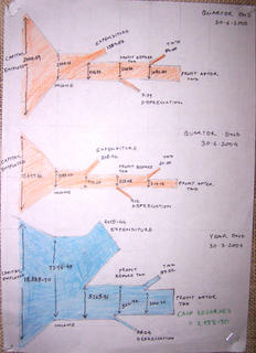
the first crash assignment was on visualizing the quarterly financial reports of IDFC…found it to be fascinating….but a huge struggle at the same time….majorly because my knowledge about finance was a big ZERO….to understand the jargon of the financial world, understand tht data, sieve through it ,extract the relevant info and make it comprehensible to the average person……….all of this in half a day was a task indeed!!.....Imagine visualizing….”Paid Up Equity Share Capital”…and u’ll know wht v were up against!!...
anyways, v came up with a Charles Minardish representation for the entire flow of the capital within IDFC…..right frm the Capital employed to Profit After Tax..
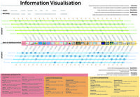
Our major assignment was sorting and categorizing through 1800 examples of Info Viz from books, magazines and the web…and come up with a classification scheme of our own…After a lot of brainstorming, we came up with a scheme of analyzing any Infographic along 5 axes:
Tools used
Methods used
Purpose of Representation
Type of Content
Way of Representation
Tools used
Color coding, Proximity, Typography, Size, Shape, Form, Layering, Symmetry
Methods Used
Level of Abstraction, Layering, Scaling, Choosing an axis- Temporal or Spatial
All these assignments were done as a group work.
No comments:
Post a Comment